A Global Perspective Update
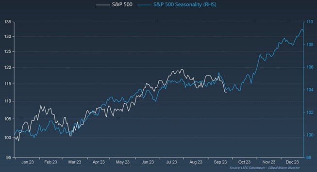
In the chart below we have used the S&P 500 as a proxy for global markets, and global market sentiment. The chart shows the seasonality of the S&P 500 index in blue whilst the white line shows the current S&P 500 year to date return up to the 24th of September. Historically the S&P 500 has a strong finish to the year. Since this chart was published, the index is around 0.6% lower however, it has since more than recovered from the October lows. The bottom line is that the tough period that we have experienced over the last 3 months could be considered as normal seasonal volatility in the offshore markets.
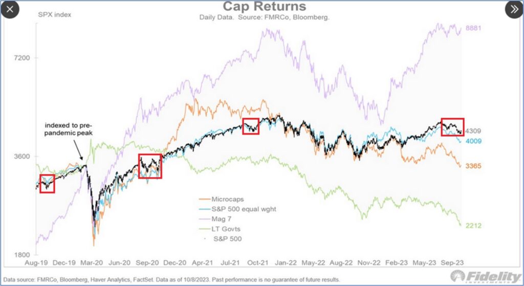
The chart below shows the return of the S&P 500 over the past few years. the red boxes highlight the Q3 seasonal retracements that the index has undergone. Q3 of 2022 did experience the seasonal retracements however, due to the nature of 2022 events, we have excluded it for the purposes of “seasonal retracements” and hence not highlighted it.
There are two other points to note in the chart. The first is that the purple line shows the return from the 7 largest tech stocks in the index. The “magnificent 7”. These 7 stocks have largely driven the entire return from the S&P 500 index on a year-to-date basis.
The other point is that government bonds (shown in green) have consistently been falling in value for the last 39 months. It has therefore been very difficult for global balanced funds to make attractive returns on a year-to-date basis.
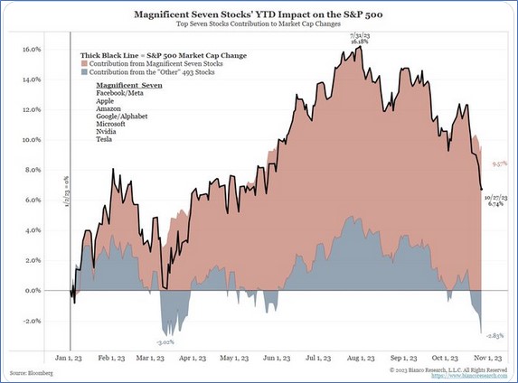
The chart below shows that as of the 28th of October, the “magnificent 7” stocks in the S&P 500 have pushed UP the overall index by 9.57% on a year-to-date basis. Conversely the remaining 493 stocks have pushed the index performance down by 2.83% on a year-to-date basis.
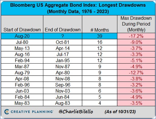
The chart below highlights that the current US bond market correction is the largest and longest recorded since the 70s.
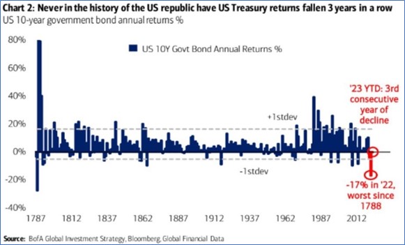
Global bonds are looking attractive relative to history. The chart below shows how US 10-year bonds are experiencing their worst consecutive annual return period since 1787.
The volatility in the bond market has therefore been very high, which most global balanced funds have navigated relatively well, all else being equal.
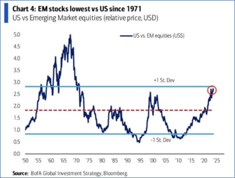
Emerging Markets are looking very attractive. The charts below shows how emerging market stock prices have underperformed the US stocks in USD terms since 2010.
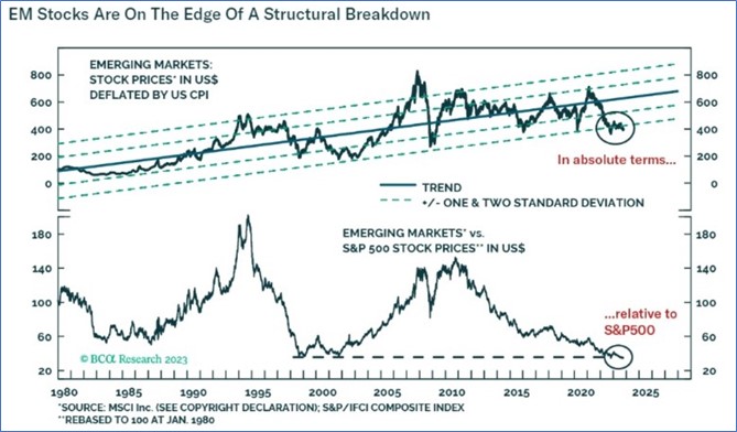
Emerging market equities are one standard deviation cheap relative to US equities (US$).
The chart below shows that relative to the rest of the world, US equities are the most expensive that they have been, relative to the rest of the world.
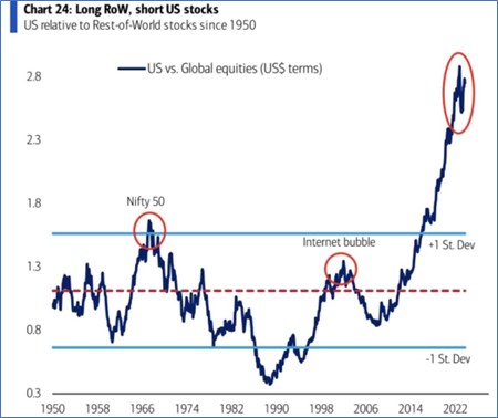
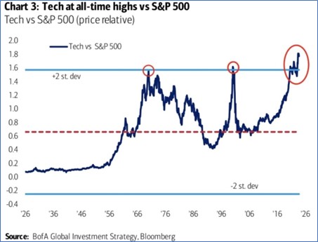
This has been largely driven by gains in US tech companies over the past several years.
As the chart shows, US tech has been flagged as being very expensive relative to the rest of the S&P 500 stocks.
Key Takeaways
The performance of the US market has been very concentrated to a select number of tech stocks which appear to be very expensive relative to the rest of the US market as well as the rest of the world.
The performance of global equity and balanced funds from January to July, was on balance, very pleasing. On the other hand, August, September, and October saw disappointing returns in global equity and global balanced funds.
Although short term, the first 10 days of November have seen a strong bounce from the October lows. With sentiment looking positive through to the end of the year.